It is April 2015 and I got a chance to work with Watchy Technology, as a Marketing Intern for two months. This is where I got a chance to see Watchy that how tech startup designed a new logo in action re-branding their company.
There is a saying by Mahatma Gandhi, Father of INDIA,
“Live as if you were to die tomorrow. Learn as if you were to live forever”.
So learning topics like game theory and decision making was always interesting for me. But real learning and understanding about decision making came through my first experience at Watchy, which was selecting the new logo for the company with the whole team.
A tech start-up and the Morpheus portfolio company Watchy technology has currently come up with new Logo. “In one instance, my friend’s sister couldn’t fly down for his wedding and she missed all the action. That’s when I decided to toy with the idea of live-streaming technology” says, Sriramkumar VH, Founder & CEO.
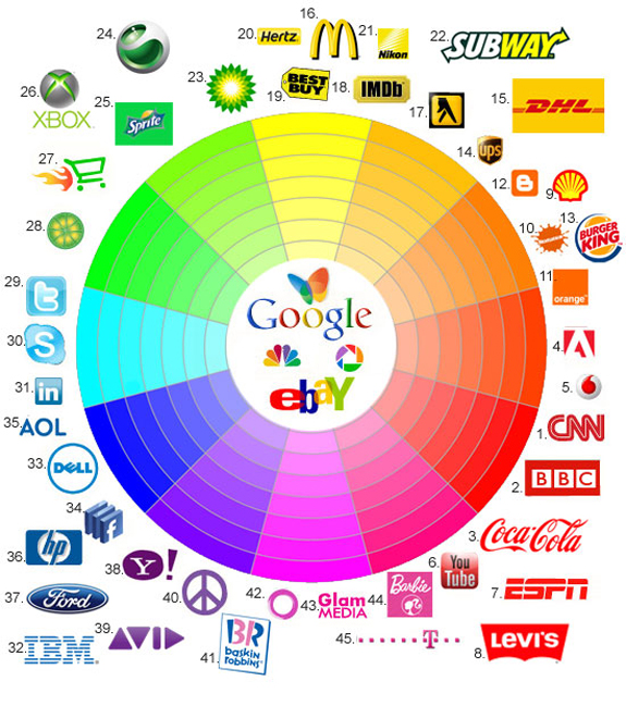
Selecting new logo for the company was not that simple task for us because logo of a company signifies many different things. Like the Apple logo is a reference from the Bible story of Adam and Eve, where the apple represents the fruit of Tree of Knowledge whereas for the Fed-ex logo, If you concentrate your attention on the letters “E” and “x”. The negative space those 2 letters create, form an arrow pointing to the right side. This signifies forward or moving forward and this is what the company does.
Hidden Meanings Behind The Worlds Most Popular Logos
1. Reason for the change of logo
In last 4 years company had been growing and had modified from live streaming company to hardware technology company and had came up with products like Bond 007 which is currently launched as ZifiLink. Change in the business positioning is the reason for new logo. Watchy: “reliable live streaming every time”.
But it’s not just about selecting a new LOGO, but it is a story of a team. A team formed by Sriramkumar, where all have equal rights to share their thoughts and ideas. An individual may have 100 of ideas, but when six people sit together for 3 days and brainstorm for 22 hours, a team arrives on single idea.
2. How watchy did it?
Selecting the logo was not as easy as we thought of. It continued to n number of rounds because what we got our final logo was never in our mind. By continuous modification in ideas we got our logo, and then we realized that this is what we wanted for our company. Paulo coelho in his novel, Alchemist says that ” when you want something, all the universe conspires in helping you to achieve it”.
(A) First round : Beginning of the journey
It was team of six Watchy’ians including me, who started the journey of logo selection for the company with the creative guy Shihab, who came up with 6 new logos on the first day. The team wanted the logo to signify Watchy’s business, vision, working and its tagline.
Watchy Logo History
While going through 6 new logos, team members were not sure of exactly what does logo should signify. Some thought it to signify company product or business process, some thought it should convey company idea.But none of them was sure.
To make it simple,t the team thought to judge logos on the basis of points allotted to different logos by the team member. Marking was done on the basis of if logo signifies video, audio, networking and is eye catchy or not.
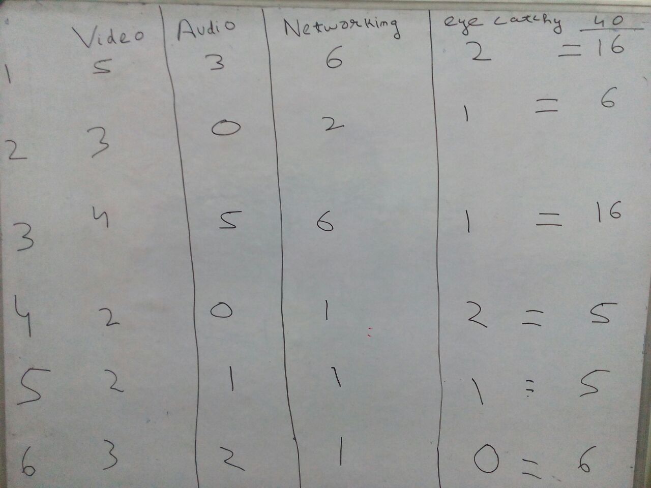
Markings Done for the Logos by Team Members
By allocating numbers to each of 6 new logos none of them seems to score good marks out of 40. But in comparison logo 1 and 3 emerge out to be winners. After six hours of long discussion, the team came up with the decision that, they want logos to display video, network, upload and download at the first look. All these feedback along with the markings of the 6 logos were given to Shihab for further designing.
(B) Second round: Team members started to visualize
It was an interesting day for all of us as a creative guy came up with 6 more new logos. This time team members started to get connected with the logo. But after the discussion there was confusion on color, shape, size and angle of the logo.
![]()
To come out with a more clear picture, the team again did the same exercise by allocating marks to different logos on the basis of different parameter like video, audio, networking and eye catchy. And after completion of the exercise, we got the following results:

Marking Exercise Repeated on the Second Day
From the exercise, it was clear that we require the logo of Watchy to look something between the lines of logo 2 and 5. Now, the team sat together and started to brainstorm. The ideas from the team members started to came on the line of product, networking and the team thought to keep V as a representation of video, inverted V as a representation of uplink, downlink speed and arrows at the top which signifies strong network which represents the tag line of the company “reliable live streaming every time”.
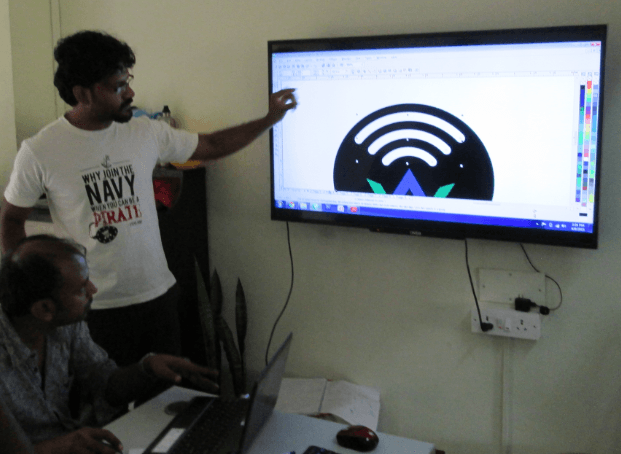
Founder Sriram vh Discussing with Shihab about the Significance of Arrow on the Top of Logo
None of the 5 was selected, but the team came up with the new one. And by doing brainstorming and collecting bits and pieces from all of the 10 logos which signifies video, audio and network. But only one logo was giving the significance of providing good internet speed even at remote places. When the arrows were redesigned inside the circle and it got split into four due to different shape and sizes suggested by team members.
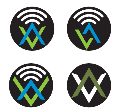
One Logo which was Designed by the Team was Further Redesigned into Four of Different Sizes
Instead of repeating the same exercise for the third time, the team decided to conduct online survey in order to take suggestion and ideas from unkown people. I have designed 5 different sets of the questionnaire on surveymonkey for the same logo and that 5 sets of online surveys were sent through email , whatsapp , social media sites to set of 5 different users. Unknown 284 users had voted for 4 logos and 1 out of them was selected which got the maximum vote in the survey.
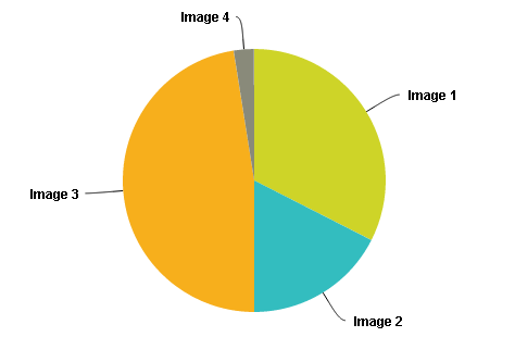
Result from Online Survey Conducted at Survey monkey.com
Clearly , logo 3 was the winner among the four. Now finally team arrived at the last stage of Logo selection.
(C) Last round: Selecting the colors for the LOGO
Selecting the colors for the logo was the last and the most important task. Asif we look at the logos of top multinational companies it signifies many different things.
Significance Of Color In Logos
The third day was the final day in terms of selecting the colors for the logo. After going through the colors from Mozilla firefox to Cadbury to Intel. And by understanding their significance, the company decided on the 6 colors that were purple, light blue, orange, dark brown, light brown and green.
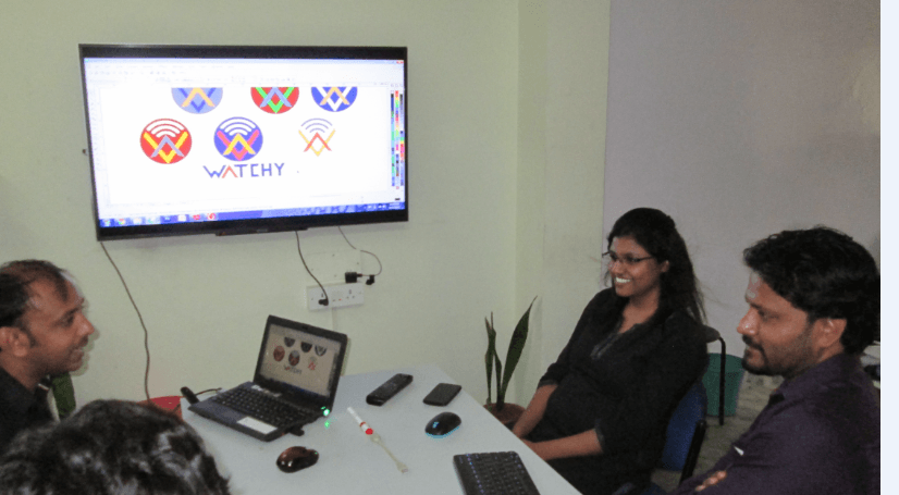
Sriramkuvh, Suhacini ,Shihab Deciding on the Colors and its Significance
Instead of simply deciding on the color of the logo by looking at the LCD. We decided to take a printout of the 6 logos on the mat paper. Because the resolution of LCD does not give the clear understanding of the colors. So I took a printout of the logos on the mat paper.
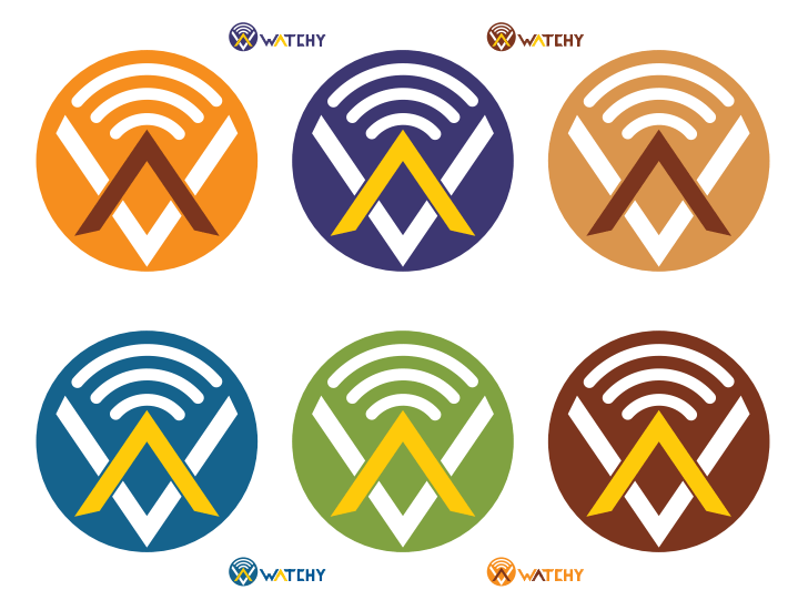
Print out of Six New Logos on Mat Paper for Better Visualization
I have taken print out of all the 6 logos and distributed to each member of the team. And given 1 complete day to decide on the final logo for the company. And the next day these were the results obtain from each team member.
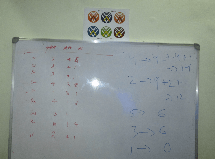
Output Obtain from the Team Members on the 6 Colorful Logos
Clearly, logo 4 was the winner by getting 14 points and by defeating the second logo by two points. And this was how the hardware startup, watchy technology got its new logo on its fourth anniversary.
Watchy New Logo
After getting our new logo we got a lot of positive feedback from our well wishers that we had never thought of like it looks like W and resembles watchy. So, this was the story of a startup getting its new logo. Watchy is a place where CEO Sriramkumar values the idea of team members as well as people. He has imbibed a working culture in Watchy, where everyone has right to express their thoughts and ideas.
It’s not just a LOGO, It’s how Watchy value ideas. I am currently working as a marketing intern at watchy technology. And this is what I have observed while working with the team.
Watchy Punch Line

About The Author: Punit
More posts by punit